
Raven Coffee
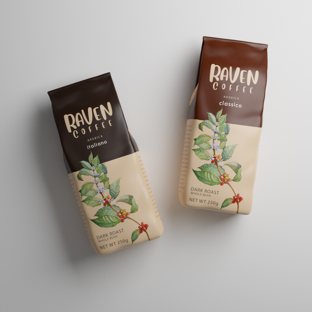
With Raven Coffee, we wanted to capture the intensity, mystery, and ritual of the perfect brew — not just as a beverage, but as a symbol of mood, depth, and craftsmanship. Raven is a brand that leans into the dark, poetic side of coffee — rich, bold, and unapologetically strong — so our visual direction followed suit.
We envisioned a cinematic 3D scene grounded in shadow and light. The bottle (or bag) of Raven Coffee sits on a matte obsidian surface, surrounded by scattered roasted beans, textured burlap, and a soft fog of rising steam. The background is moody — ink black fading into deep browns and burnt sienna tones — evoking an early morning or late-night coffee ritual.
To reflect the name, we introduced a raven feather delicately resting beside the product, a nod to both the brand identity and the elegance within its darkness. Subtle glints of copper on the logo and label added sophistication and warmth — like the first light catching your coffee mug.
We modeled the packaging with careful precision — the crinkle of the bag, the typography emboss, the slight sheen of fresh roast oil on the beans. Everything was designed to feel tactile, aromatic, and real. Even the lighting was intentionally directional, like a spotlight in a noir film, highlighting the product while letting the shadows breathe.
The final result felt like a coffee lover’s dreamscape — a hero render that didn’t just show coffee, but told its story: mysterious, addictive, timeless. Raven used the visual in digital ads, launch teasers, and their website hero section — and it became an instant anchor to their bold identity.